All images used on this website are the property of their respective copyright owners.
Some products are formulated with fairer skin tones in mind, so please look out for the type of products recommended to you during your consultation for the best results.

Spring Clear / Bright

Spring Pale

Spring Light

Spring Vivid

Summer Clear / Summer Light

Summer Whitish

Summer Pale

Summer Soft

Autumn Clear / Strong

Autumn Soft

Autumn Dull

Autumn Deep

Winter Clear / Winter Bright

Winter Vivid

Winter Deep

Winter Dark

Neutral

Neutral Mute

Neutral Cool

Neutral Warm

Cool (Medium)

Cool (Medium)

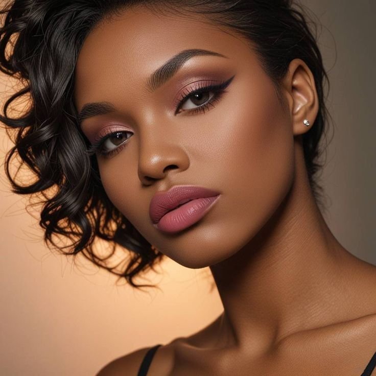
Cool (Medium-Deep)

Cool (Medium-Deep)
Cool (Deep)

Cool (Deep)

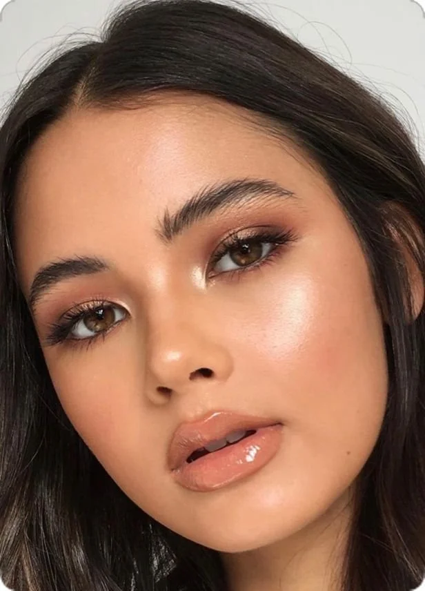
Warm (Medium)
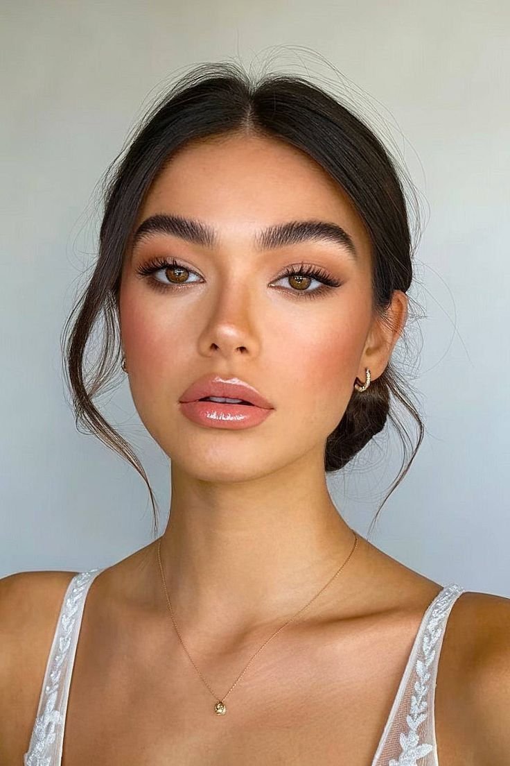
Warm (Medium)
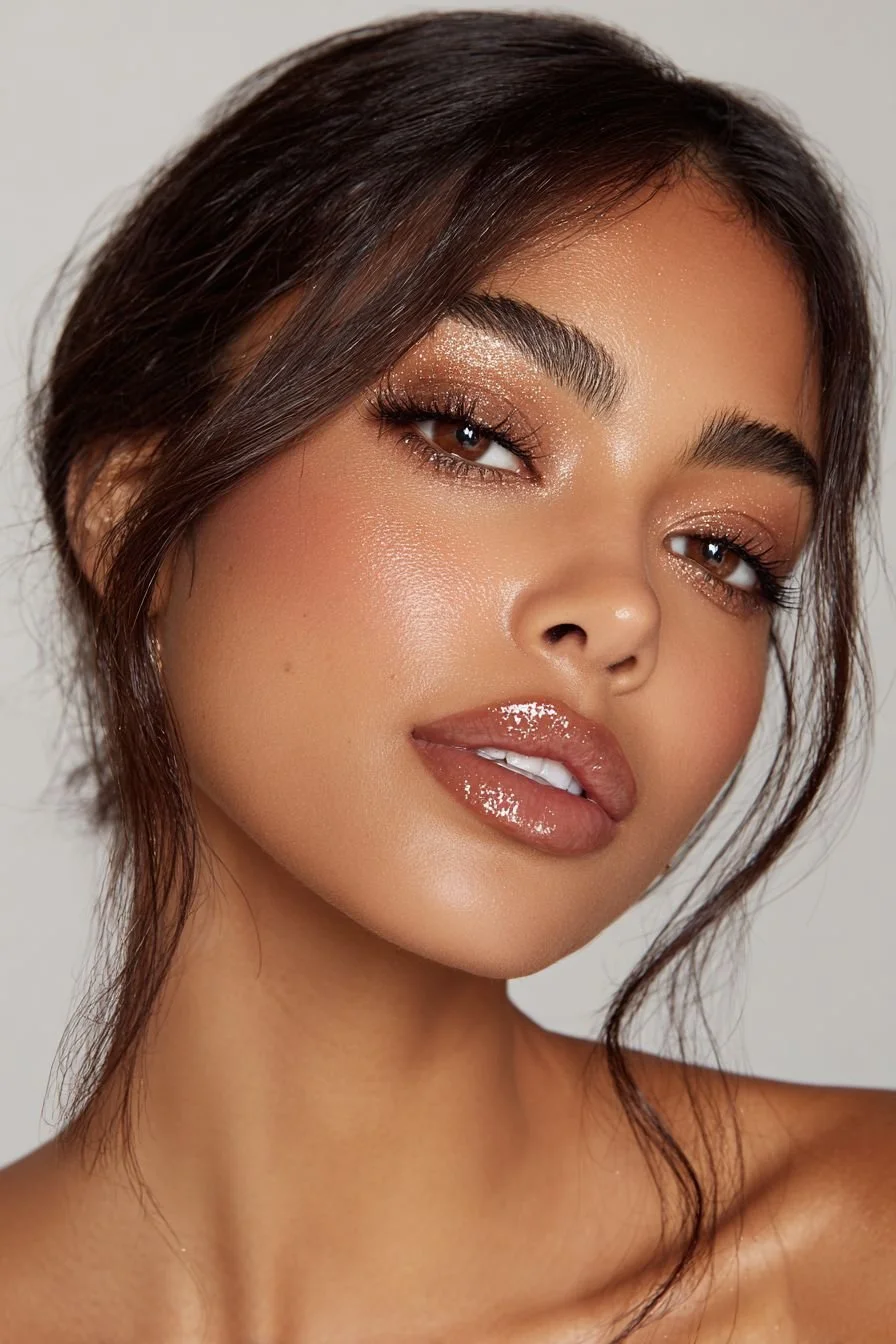
Warm (Medium)

Warm (Medium)

Warm (Medium)
Warm (Deep)

Warm (Deep)

Warm (Deep)
To access the product library corresponding to your seasonal palette, kindly click on the link that represents your designated palette.
NEW: Some K-Beauty products now include direct links (click on image), allowing you to purchase them directly from authentic sellers on Shopee.
code.d’s Color Positioning Charts


Brands’ Official Color Positioning Charts

3CE Multi Eye Color Palette

3CE Face Blush

3CE Drop Glow Gel

CLIO Pro Eye Palette Air

WAKEMAKE Soft Blurring Eye Palette

WAKEMAKE Soft Blurring Eye Palette

BBIA Ready to wear Eye Palette

CLIO Pro Eye Palette

CLIO Pro Eye Palette Air

3CE Makeup Products

BBIA Ready to wear Eye Palette